React JS Animations: In React JS the Animations is quite a popular and interesting topic to create different types of animations. Most of the developers use CSS and add classes to HTML tags. The Greenock is used to create complex animations because it contains the most powerful tools which contain more libraries and components which help to create animation in the React JS
React JS Animation Methods
Here we are providing 5 different methods to create animation in React JS
- CSS Method
- React-transition-group —add on a component used for implantation of basic CSS animation and transitions.
- react-animations– It implements animations from animate.css
- React Reveal — animation framework in React
- TweenOne —It is a library that ant.design uses for animation.
CSS Method
The CSS method is the simple method to create animation and you can use this method rather than javascript to maintain the size of your application and the web browser uses few resources. These have a major impact on the app productivity and in case simple animation no needs to consider the size, just consider the method.
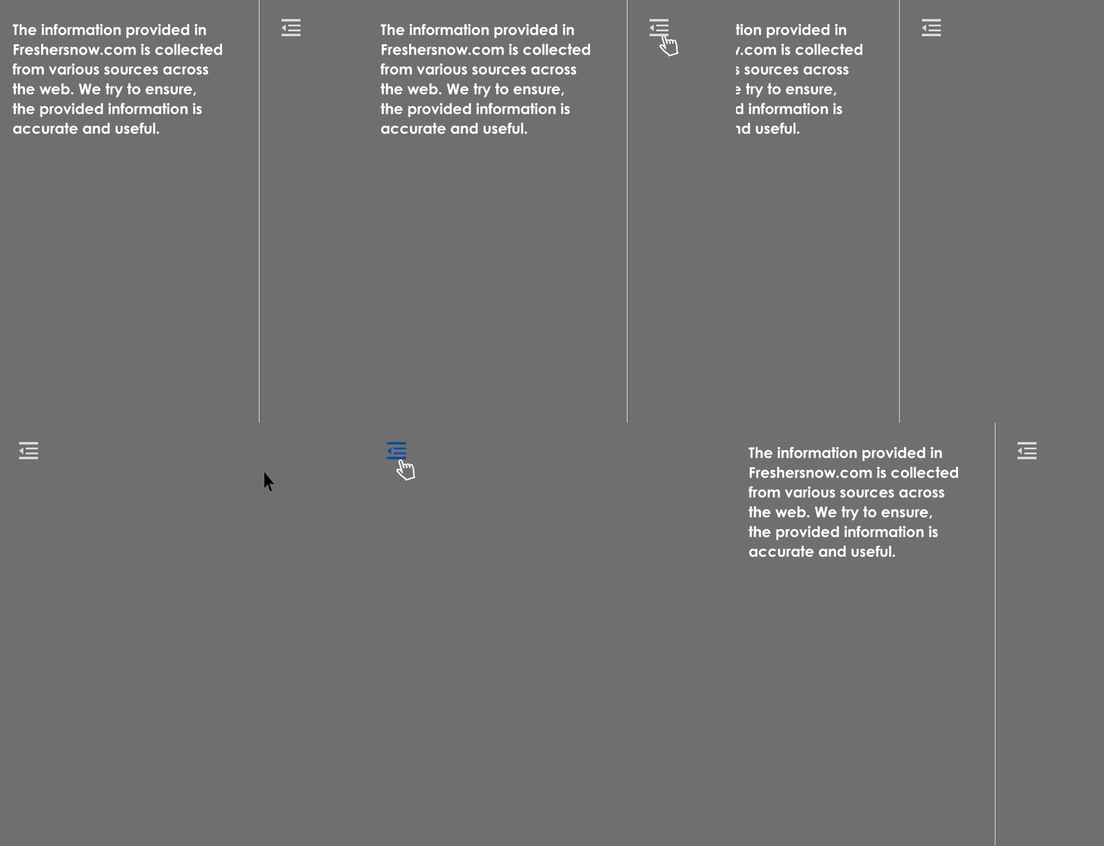
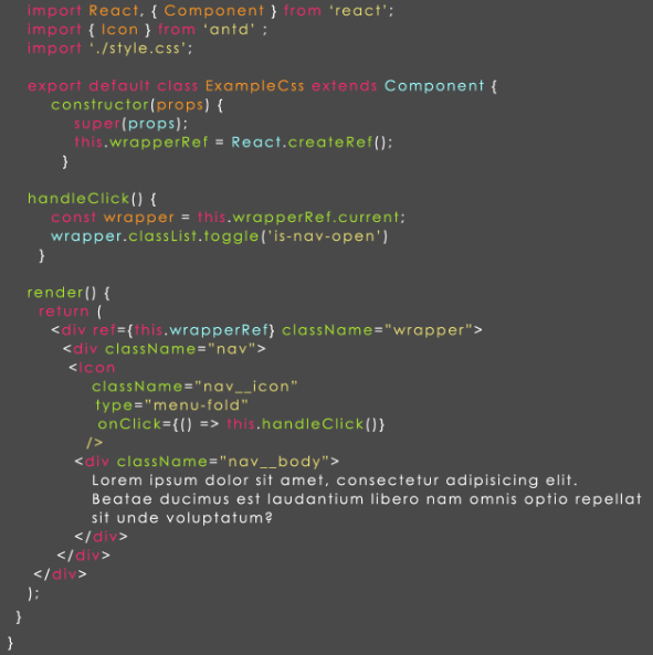
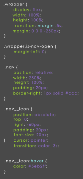
This menu is easy while using CSS property and trigger ClassNAme=”is-nav-open” for Html tag. To explain this example we created wrapper above navigation which has constant width 250px and to changes in the margin with margin-left or translateX property with the same width.
To show navigation we can add ClassNAme=”is-nav-open” to wrapper and move wrapper to margin-left/translateX: 0;
CSS Method Example
This is the method used for many times but using several CSS lines and triggers(className) than using more complex libraries in your code. But we might want to use other methods in some cases. So, let’s have a look for other methods.
ReactTransitionGroup
This add-on component was developed by the React JS community and it is the easiest way to create CSS animations and transitions.
Some of the developers describe the library as “A set of components for managing component states (including mounting and unmounting) over time, specifically designed with animation in mind.”
The most important things should know about ReactTransitionGroup
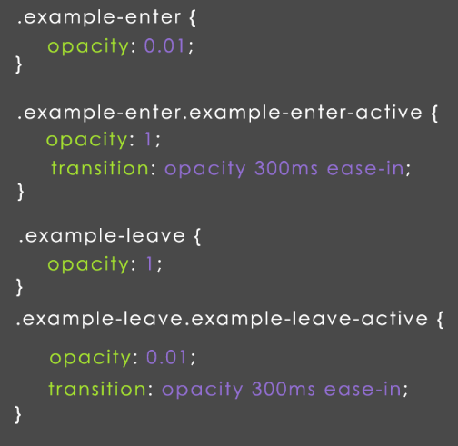
1.When the component life cycle changes the ReactTransitionGroup changes classes that means animated style should specify in CSS classes.
2. The ReactTransitionGroup is of small in size so it should be installed in packages, in case you required them you can use CDN.
3.ReactTransitionGroup has 3 main components used to get the animation and you need to wrap the component in transition, CSS transition, and transition group.
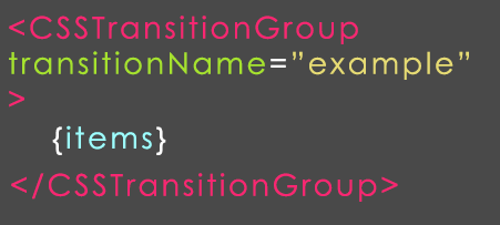
Here you need to import CSSTransitionGroup from react-transition-group and later wrap the list in it to set transitionName props. In case the child in CSSTransitionGroup may add or delete will get animation styles.
If you want to set tarnsitionName=”example” props, the style sheet classes should start with example name.
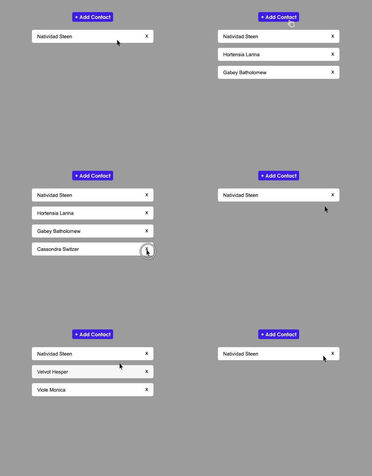
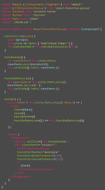
To get the contact list we need to add two methods that are described below.
- handleAdd– to add new contacts & with the random name it will push array state items.
- handle Remove– to remove contact by the array index in state.items.
Contact list Example
React-animations
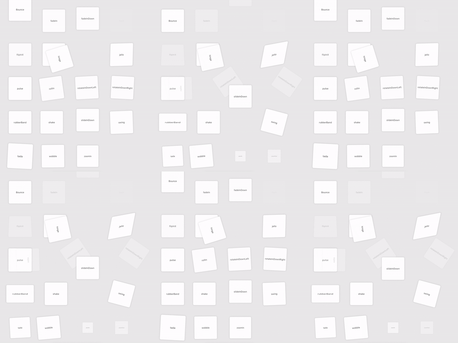
In React-animations the library is built with a lot of animations in animate.css It will work with any inline style library which supports the use of objects to specify keyframe animations like radium, Aphrodite or styled-components.
Bounce Application
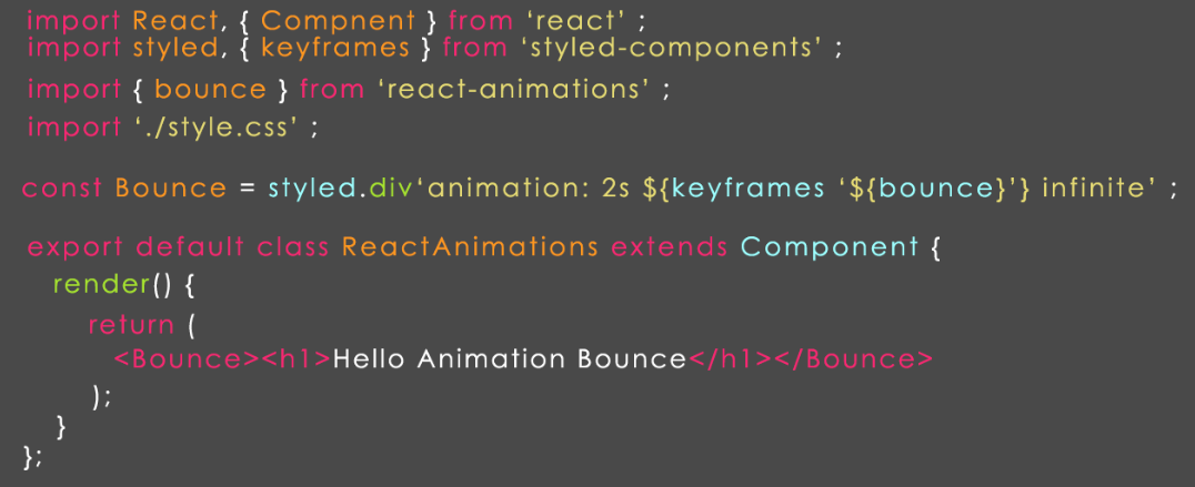
To create a bonus application at first you need to call animation from react-animations. Here we used a styled component after creating a wrapper component with basic keyframes and animation style.
After the creation of the component, you have to wrap any HTML or component for animation.
Bounce Application Example
A good solution for using the above-mentioned animation on scroll-react-animate-on-scroll.
React-reveal
React-reveal is used for basic animations like fade, flip, zoom, rotate and more animations because it will help to control all animations with props,.If required we can use custom CSS effects and also has server-side rendering and HOC. In case we want to create a framework for animation on scroll.
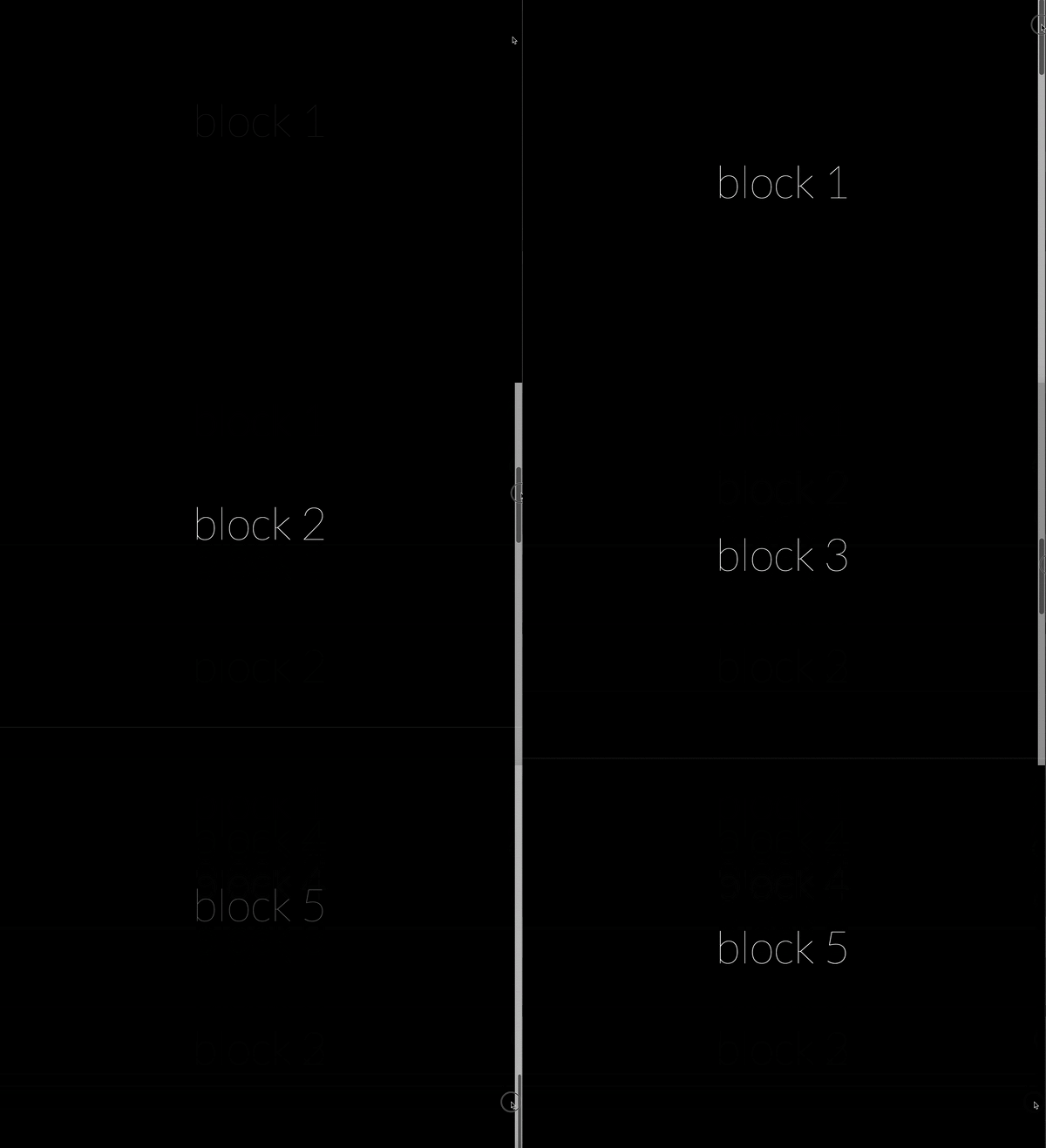
Let’s see the animation with scroll effects
Here we have created 5 blocks, with full-screen page and title inside.
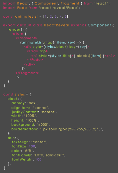
In the above example, we have created an animated list constant which contains 5 elements. The array method map usage completed then you can add each element fade components and can inserts items to the title. We have created 5 blocks with fade animation from the top because the Const styles have short CSS styles.
TweenOne and animation in Ant Design.
The Ant Design is the React UI library which is easy to use components. To build an efficient user interface this is the best choice because AntDesign was created by Chinese conglomerate Alibaba and also commonly known as Alibaba, Tencent, Baidu, and others.
Let’s see Ant Design animation page
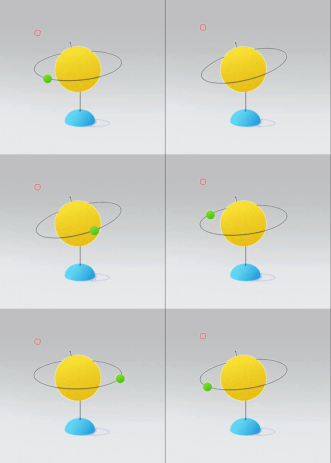
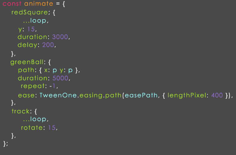
As you can observe there are a number of animation elements and in short version of these elements is described in the below image. Here we created a global green ball and one element, and one animation is red square on background, it works as shown in the figure.
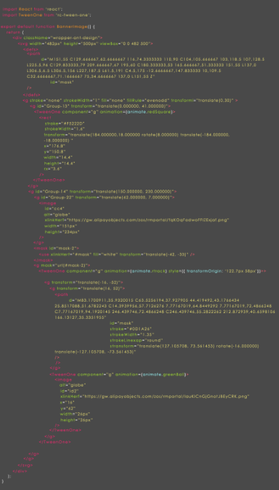
Here we used the TweetOne component in animation but it also needs path plugins to use path in animation. In case you push PathPlugin to TweenOne.plugins it will work efficiently.
Basic Animation Parameter
1.Duration- animation time in ms
2.ease- to ease the animation
3.yoyo-To alter forward and backward with repetition.
4.repeat-to repeat animation and use -1 for the indefinite process.
5.p-path coordinates for animation.
6.easePath- It is also to coordinate for animation
NOTE: The last two parameters are more specific in SVG.
Animation Objects
1.redSquare- the redSquare has loop parameters,y coordinate, delay, duration which are described below.
2.greenBall- the greenBall has a path with object parameters x,y with value p. The duration is repeat and ease is TweenOne.easing.path function with 2 parameters.
3.path- it is the basepath coordinate.
4.lengthPixel- it is the divided curve into 400 sections
5.track- An oval with axis contains loop styles and rotate parameters.
NOTE: Pay attention to the TweenOne component because these components are called from rc-tween-one which is used as a basic component with base props and animation props.
Just place attention on the following lines.

